Project Brief
The primary objective was to introduce the bakery’s product line to the U.S. market while supporting sales efforts with a range of brand materials.
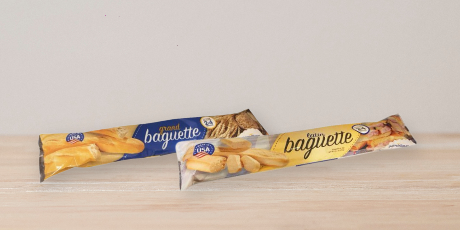
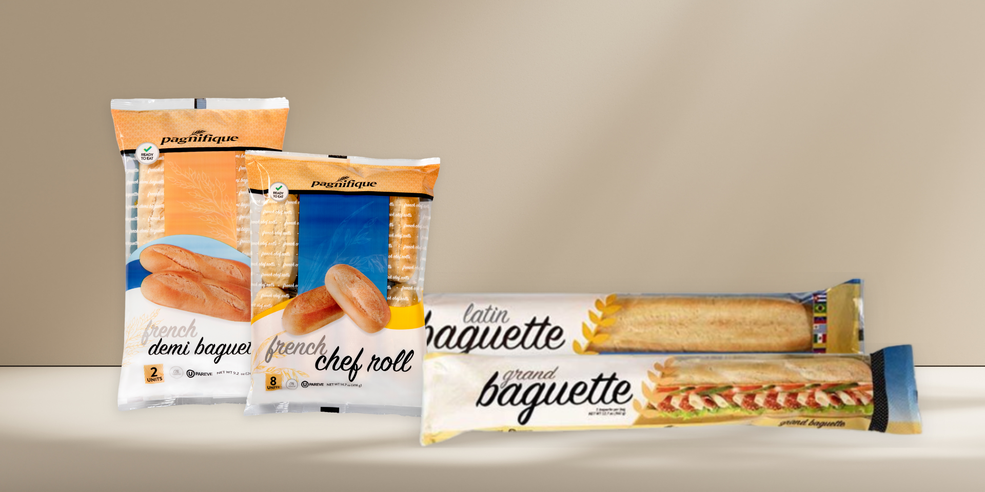
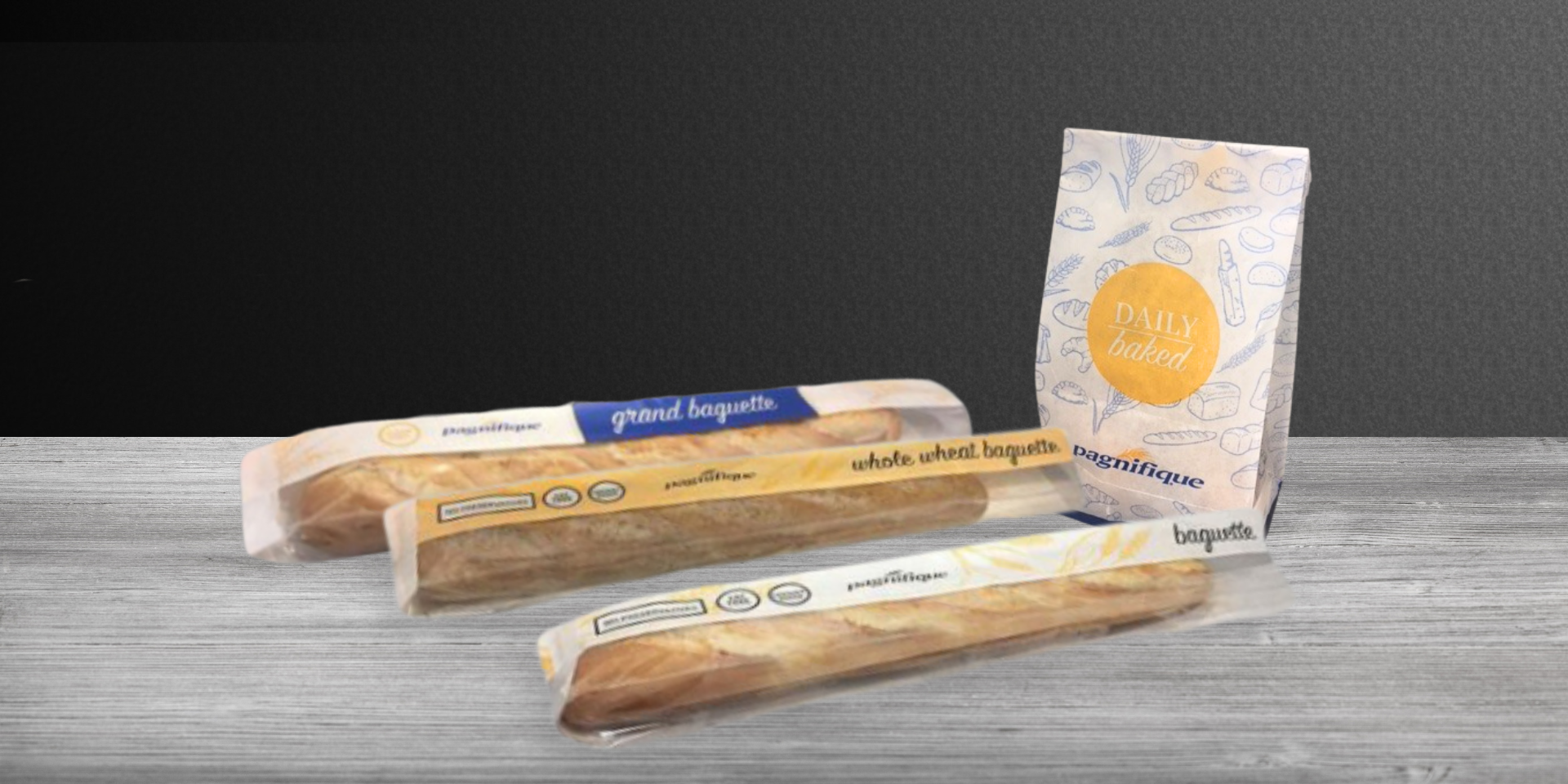
Designing and overseeing the creation of three distinct product packaging lines.
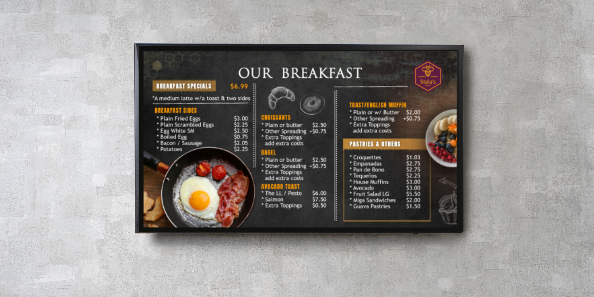
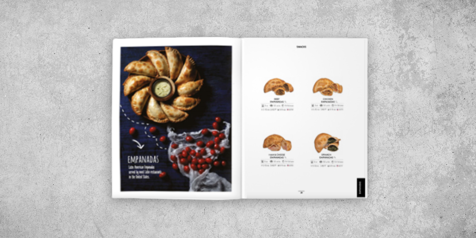
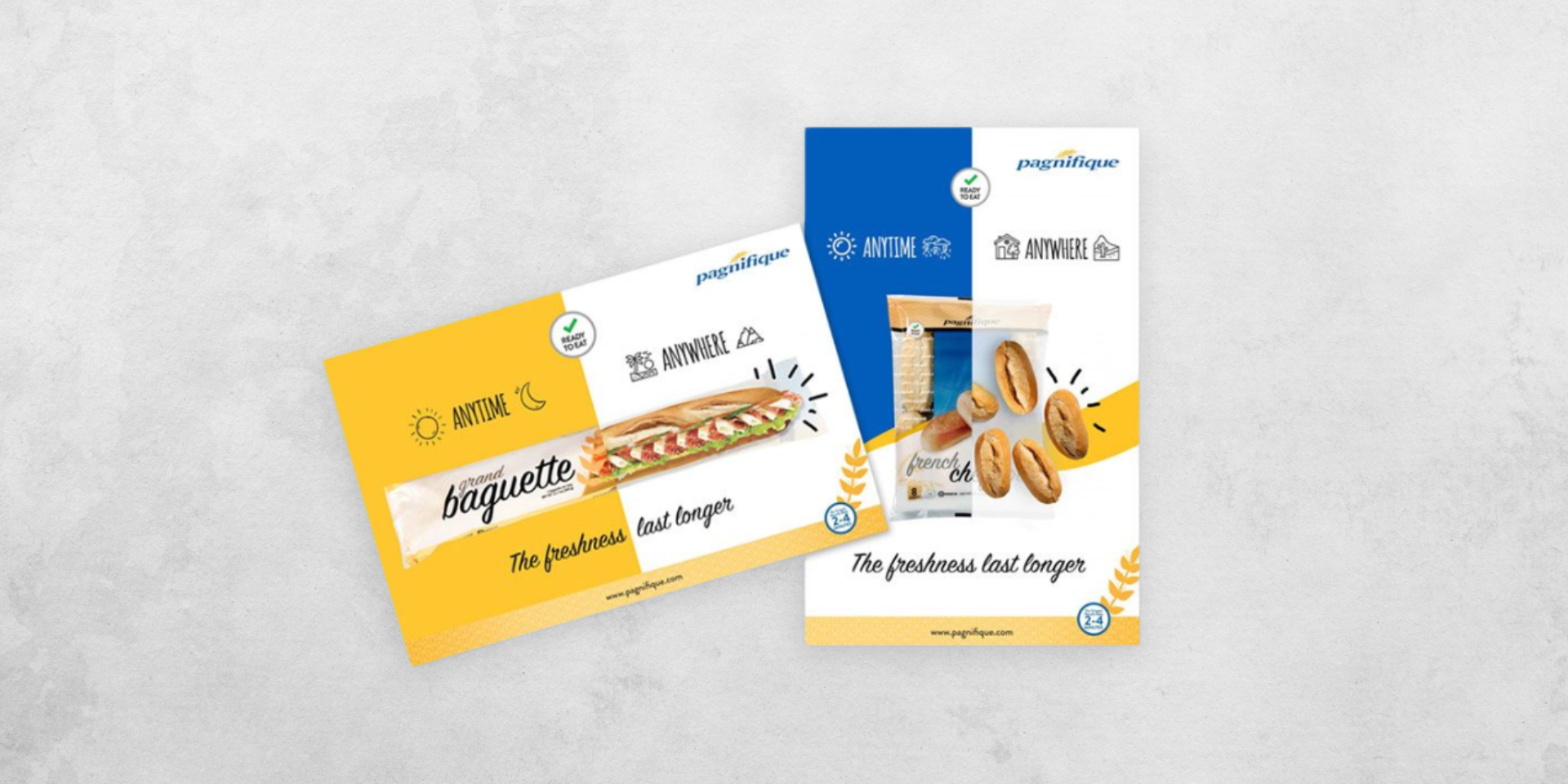
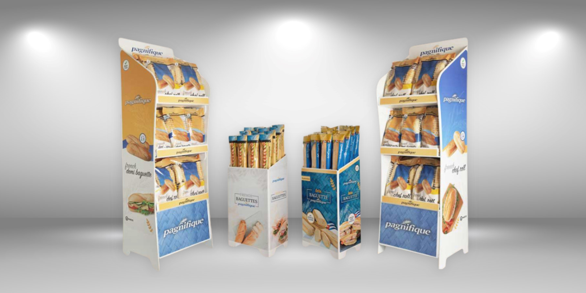
Developing promotional materials including product catalogs, sales sheets, advertisements, and display assets.
Directing a photography photoshoot to showcase the products in the most compelling and professional way possible.
This comprehensive rebranding initiative not only elevated the bakery’s presence in the U.S. but also aligned the company with the expectations of the local market, ensuring long-term success.
My role was to create a comprehensive rebranding strategy, without losing the brand’s essence, designed to elevate its presence in the highly competitive U.S. market. Through the analysis of current trends, consumer behavior, and market dynamics, I developed a refined brand identity that resonates with target audiences while maintaining the company’s core values. This rebranding not only reflects innovation and authenticity but also ensures a solid competitive advantage in an ever-evolving market landscape.
Designing and overseeing the creation of three distinct product packaging lines:
+ Ready-to-Eat Breads
+ Frozen Breads
+ Hot Breads
Additionally, I managed and followed up on the production process to ensure the packaging was executed accurately and met quality standards.
I was responsible for designing a wide range of promotional materials, including product spec sheets, product catalogs, sales sheets, in-store display units, supermarket exhibition stands, banners, and additional marketing collateral. These materials were thoughtfully crafted to elevate brand visibility and effectively convey key product features to consumers. By incorporating visually engaging design elements and clear, concise messaging, I ensured that all promotional materials captured attention, enhanced customer engagement, and contributed to boosting brand presence and sales in retail environments.
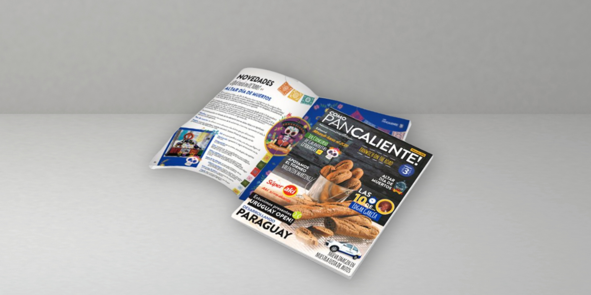
I was responsible for designing the monthly digital magazine, ensuring it was visually appealing, on-brand, and engaging for readers. Each issue was carefully crafted to highlight key content while maintaining a consistent, modern aesthetic. Additionally, I designed website mockups to provide a clear visual representation of the site’s layout and user experience. These mockups were developed with a focus on usability, visual flow, and ensuring the site’s design aligned with the overall brand identity. Both projects aimed to create cohesive, attractive digital assets that enhanced the user experience and strengthened the brand’s online presence.
Leading a photoshoot to present the products in the most impactful and professional manner.